Loss development patterns#
import chainladder as cl
import pandas as pd
import warnings
warnings.filterwarnings('ignore', category=UserWarning, module='chainladder.core.base')
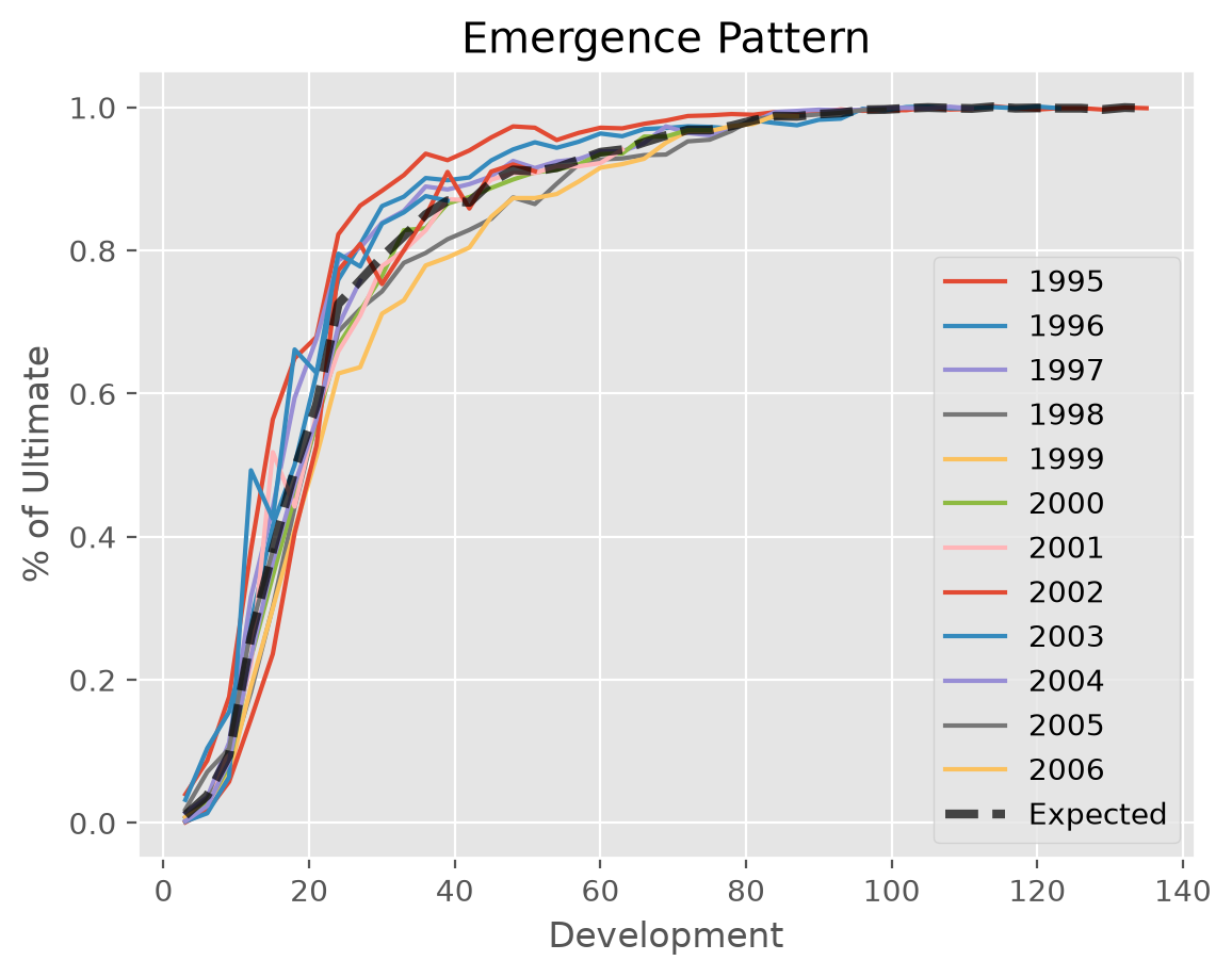
This example demonstrates the visualization of the loss development patterns as a percentage of ultimate claims to analyze emergence patterns. It shows how individual origins develop relative to their estimated ultimates, alongside the estimated development pattern across all origins. This helps identify unusual development behavior and validate reserving assumptions.
Specifically, each individual development curve shows the ratio of cumulative claims to ultimates_ for each origin year, calculated using the Chainladder estimator. The average development pattern represents the expected emergence pattern, derived from the cumulative development factors cdf_.
# Load sample data
quarterly = cl.load_sample('quarterly')['incurred']

quarterly_dev = cl.Pipeline([
    ("dev", cl.Development()),
    ("tail", cl.TailCurve(projection_period=0)) # neglect tail projection
]).fit_transform(quarterly)

# Fit Chainladder estimator
quarterly_model = cl.Chainladder().fit(quarterly_dev)

# Calculate emergence triangle and expected emergence
emergence = (quarterly / quarterly_model.ultimate_).T
expected = (1 / quarterly_model.cdf_).T

# Unify results in a single DataFrame
expected.index = emergence.index
expected.columns = ['Expected']
result = pd.concat([emergence, expected], axis=1, keys=['Actual', 'Expected'])